Sebra

Loved by children, reimagined for adults

Best known for their children’s titles, Welsh-language publisher Atebol set out to broaden their audience with a new imprint aimed at adult readers. To establish a strong foothold in an already saturated market, they needed a bold, distinctive approach that would generate immediate traction.

Posters along graffiti wall promoting Sebra book publisher with bright green logo and graphic book spine apertures revealing evocative images
The brand launch drew interest from several established authors keen to collaborate.
Sebra achieved sales results ahead of forecast, reflecting a strong market response.
From 0 to 11 adult titles in first year, with Sut I Ddofi Corryn, by Mari George, winning Wales Book of the Year, 2024.
  • Bookshop window poster featuring bright green clapperboard graphic made of book spine shapes with white type on dark grey

Establishing the brand

Turning heads before pages

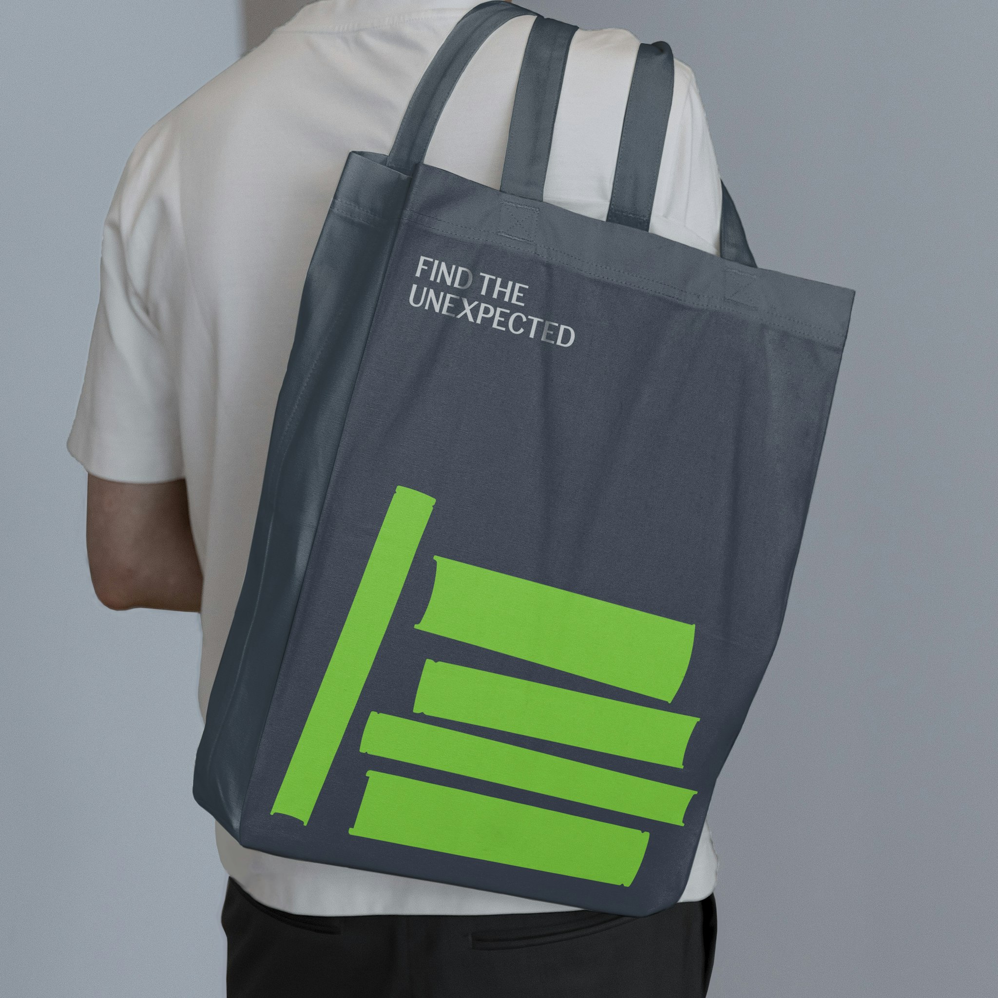
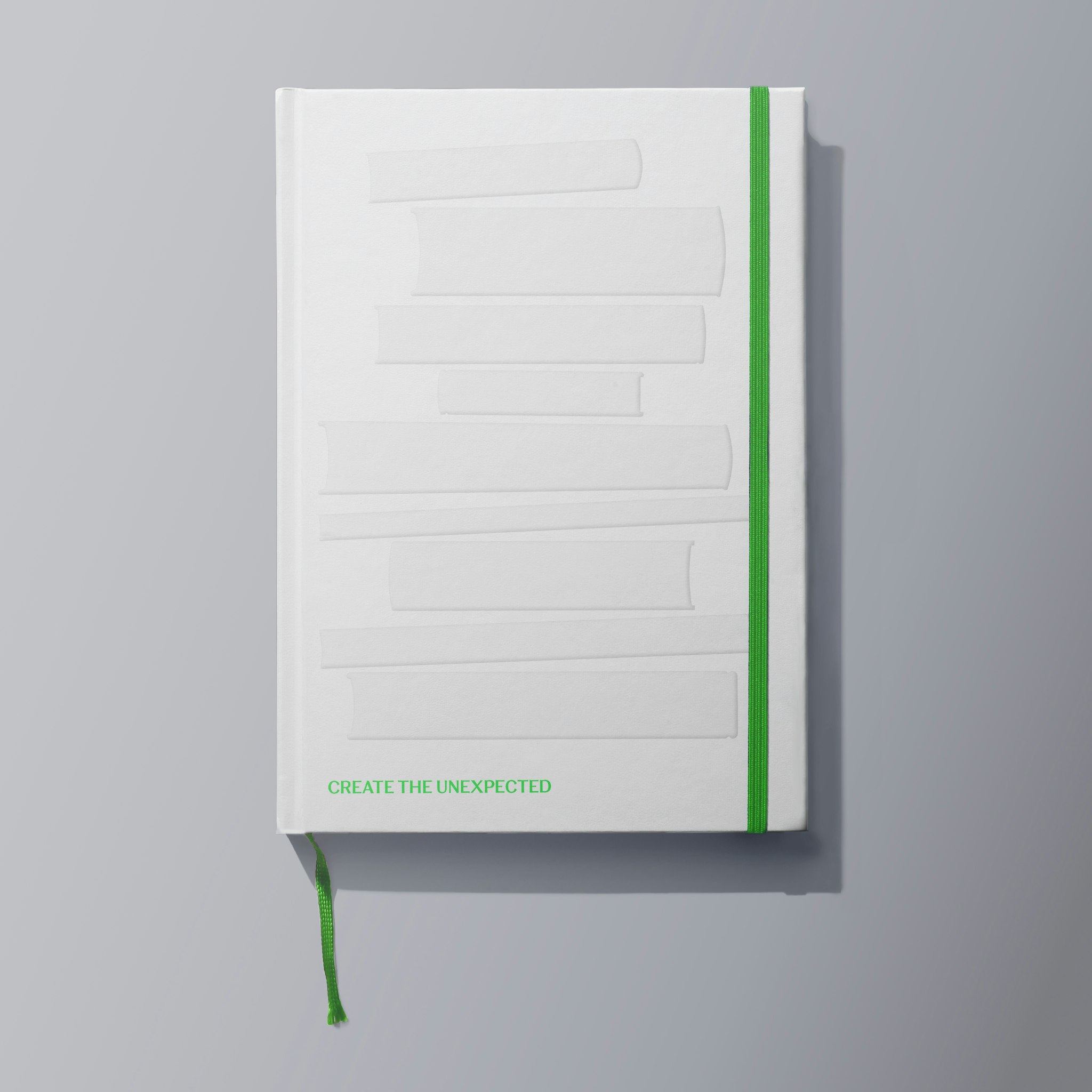
A strong visual presence was key to generating early momentum for the brand – even before any books were launched. Our bold, playful approach sparked conversation and made the brand instantly recognisable. An untameable zebra, made of books which would later morph into new forms or act as windows to imagery addressed the core audience’s emotional touchpoint: ‘find the unexpected’. 

  • Bright green historic building icon made of book spine shapes with 'History' book genre text on dark grey background
  • Bright green barbell icon made of book spine shapes with 'Fitness' book genre text on dark grey background
  • Bright green icon of two book spine shapes leaning together with 'Romance' book genre text on dark grey background

Book design

Creating a framework for success

We saw a clear opportunity for Sebra to stand out in a market where many Welsh-language books felt dated and lacked visual appeal. Through a series of collaborative workshops, we equipped the Sebra team with the tools and knowledge to build a cohesive visual framework for their book design. These guidelines were essential in making the Sebra brand synonymous with bold, unexpected titles – brought to life with a strong focus on craft, creativity, and production quality.

  • Three Sebra brand guideline pages showing book cover and spine design rules with bright green book-shaped graphics on dark grey background
  • Man walking past dark grey painted brick wall with bright green wayfinding arrow graphic formed from book spine shapes
  • Back view of man in white T-shirt carrying dark grey tote bag with bright green book spine graphics and 'Find the unexpected' text
  • White notebook with blind embossed graphic of stacked books, 'Create the unexpected' tagline and bright green elastic band
  • Outdoor hoarding with book spine-shaped apertures filled with atmospheric imagery and white Sebra logo on bright green background

Client feedback

The team at Clout are always able to bring clarity to complexity, and their deep thinking and understanding of the business or challenge always lead to an excellent, standout result.

Owain Saunders‑Jones

CEO