Carne Group
Rebrand
Carne is a €400m business, with over 650 employees in eight countries, that operates in a complex area of asset management, helping many of the world’s leading financial institutions handle the legal and regulatory obligations of their funds and portfolios across global markets.
The challenge
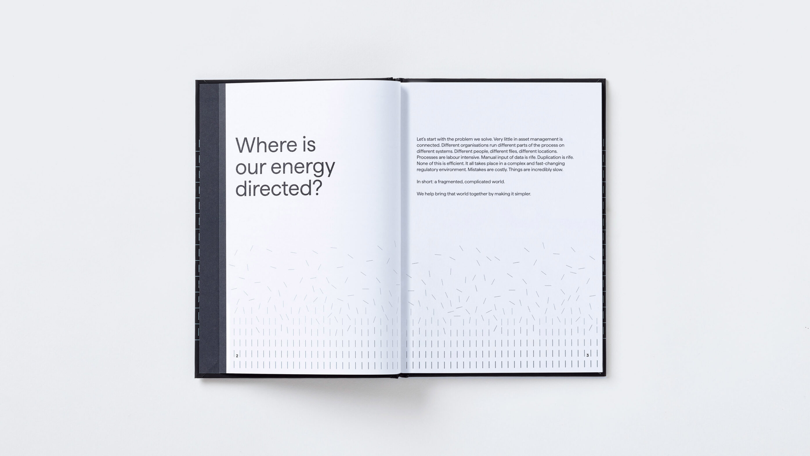
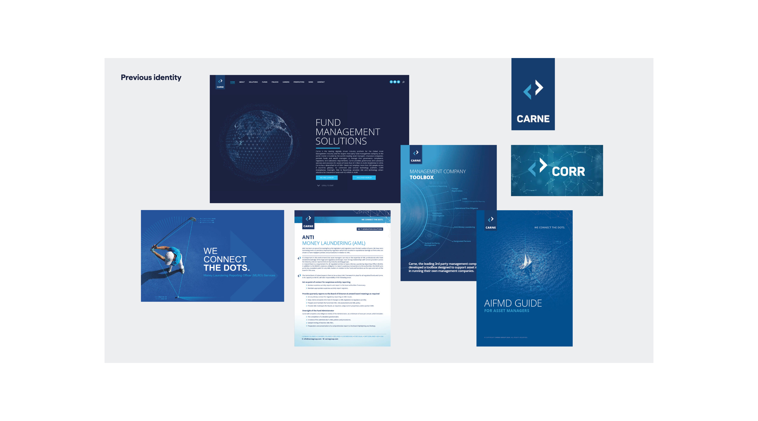
Carne’s brand and communications had become very complex and hard to navigate. They struggled to articulate their offer, listing over 40 products and services, leaving clients daunted. Ironically for a company that made things simpler, they communicated complexity. Visually they had taken refuge in cliches common across the industry, but research showed that there was no cut-through – people were simply unaware of their capabilities.

Our approach
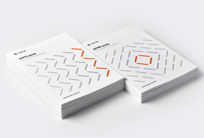
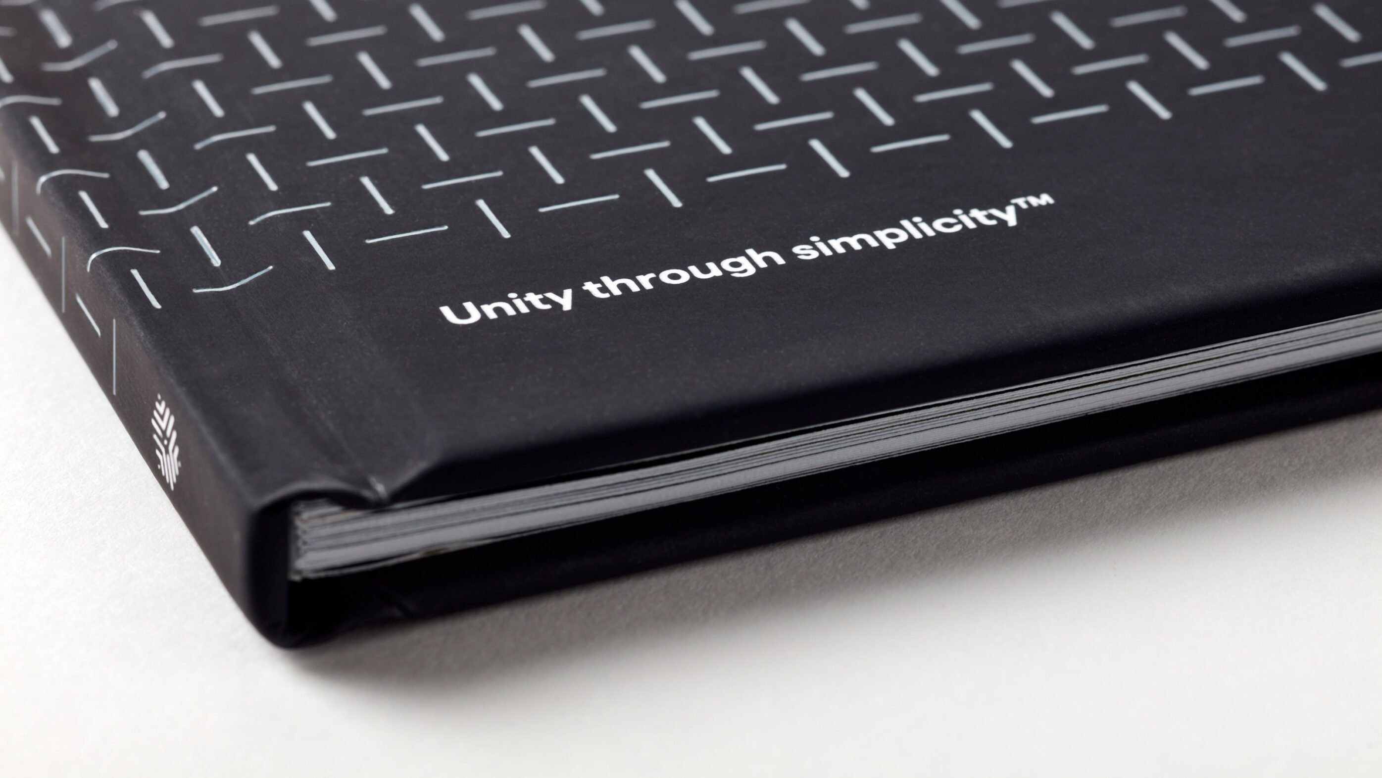
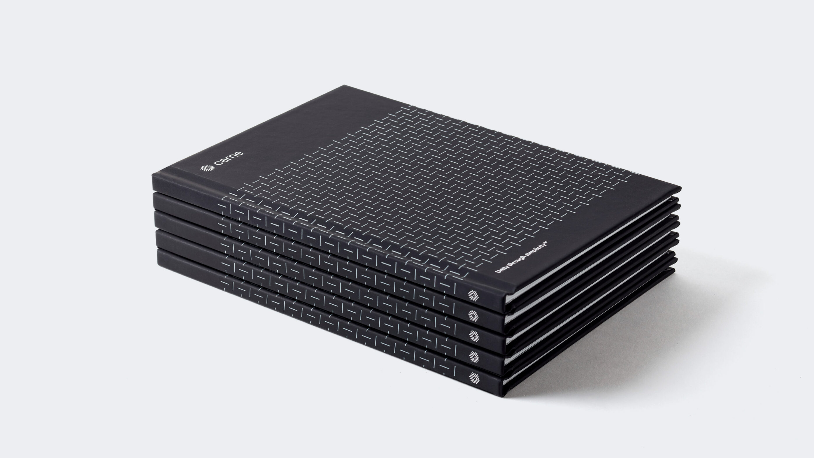
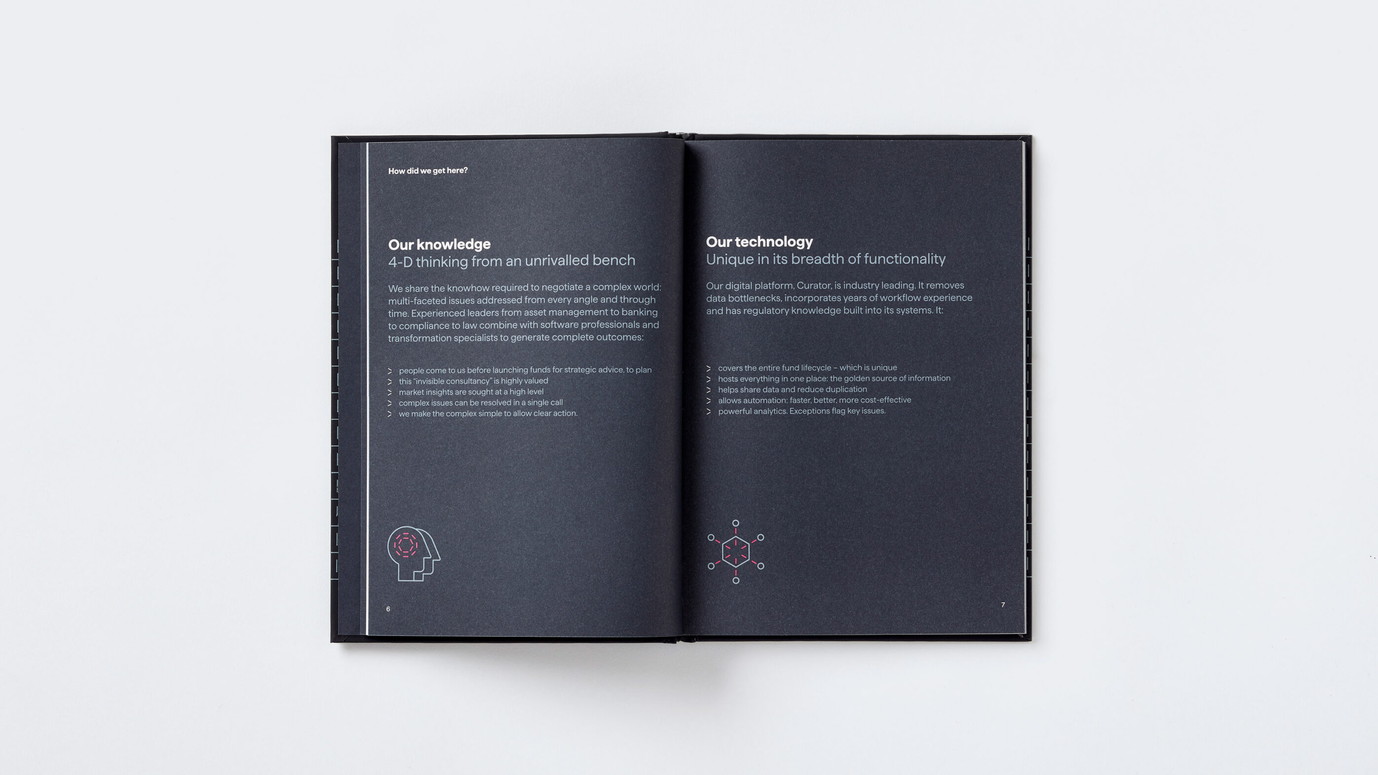
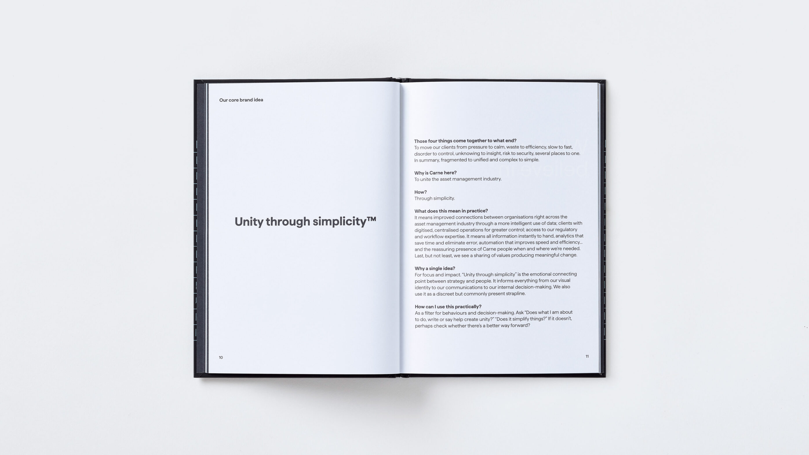
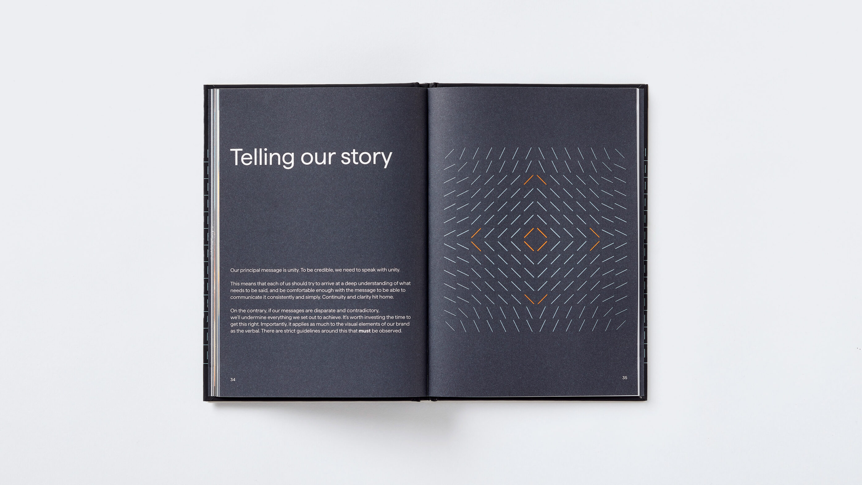
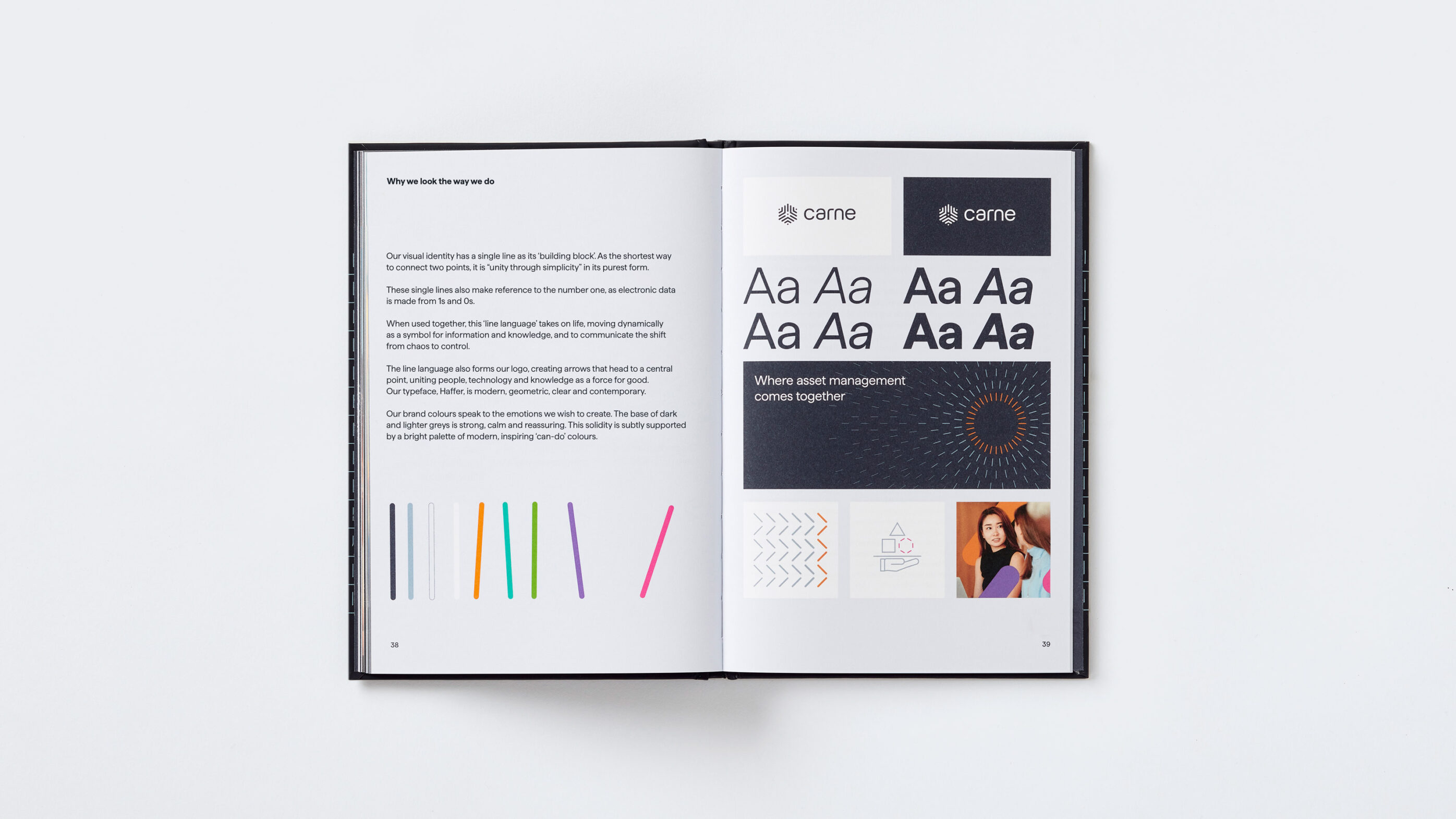
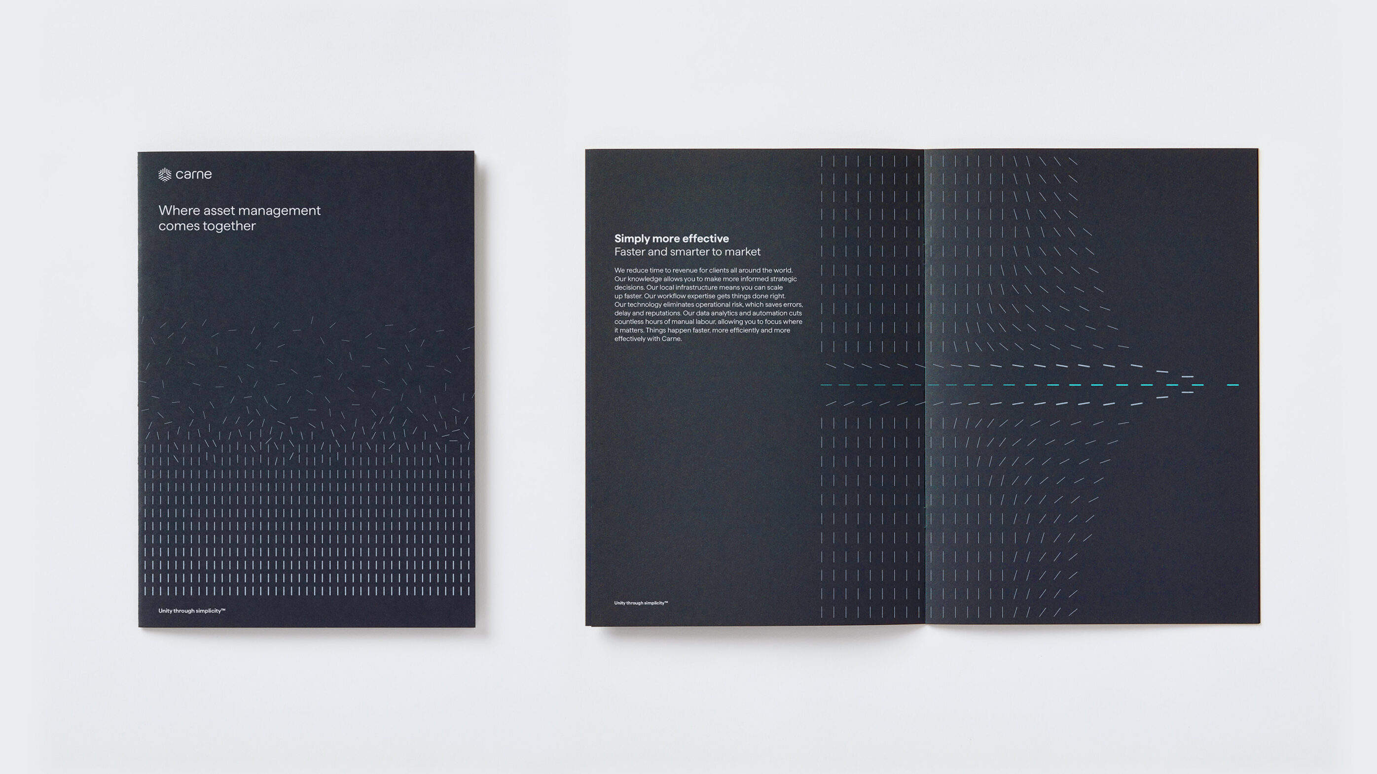
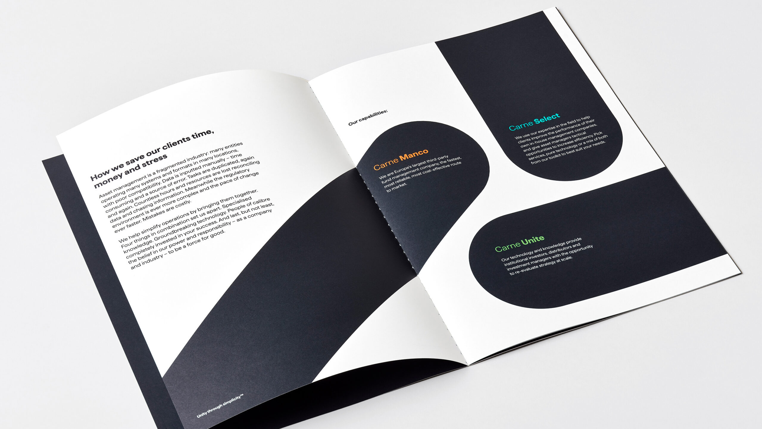
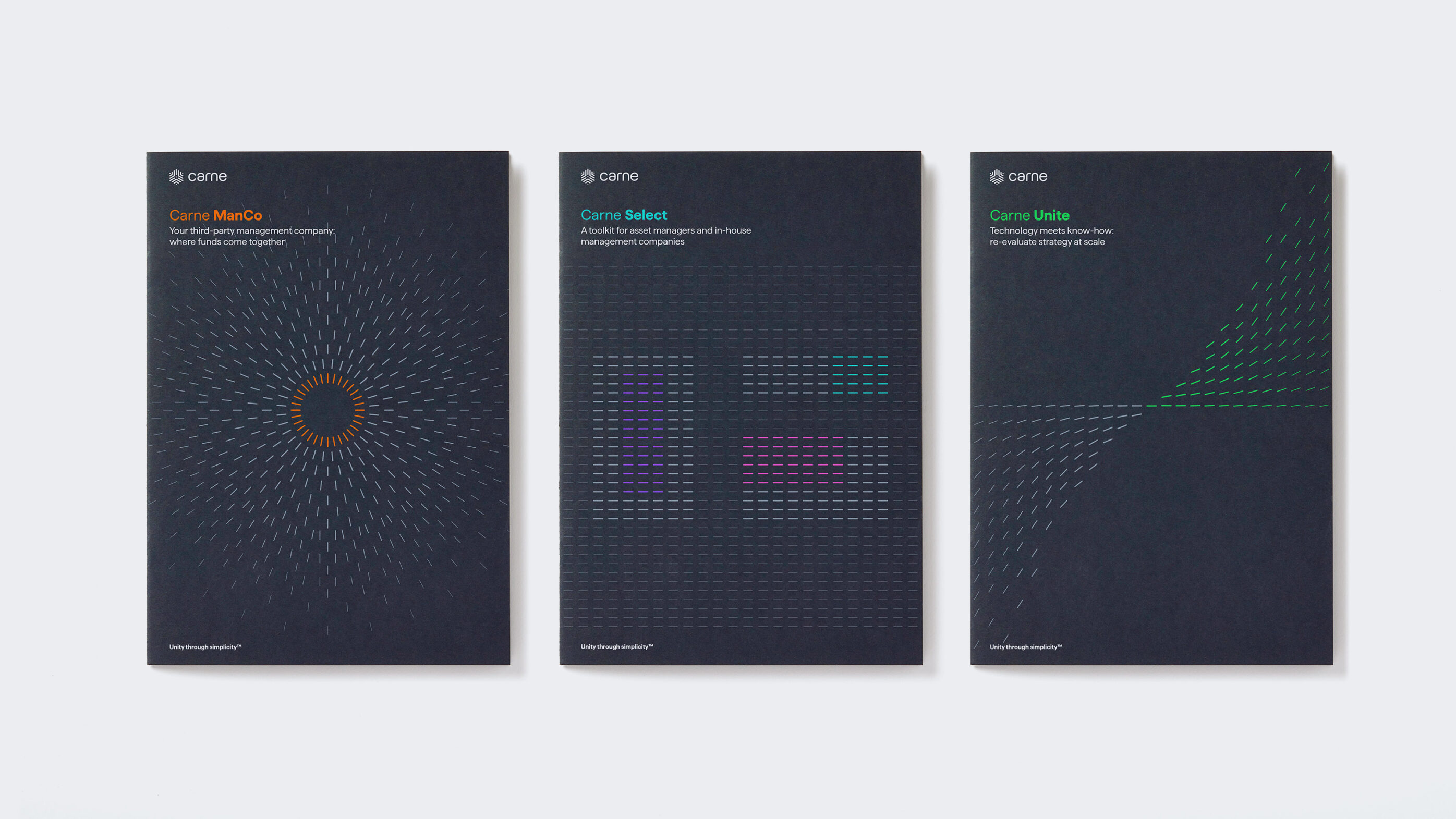
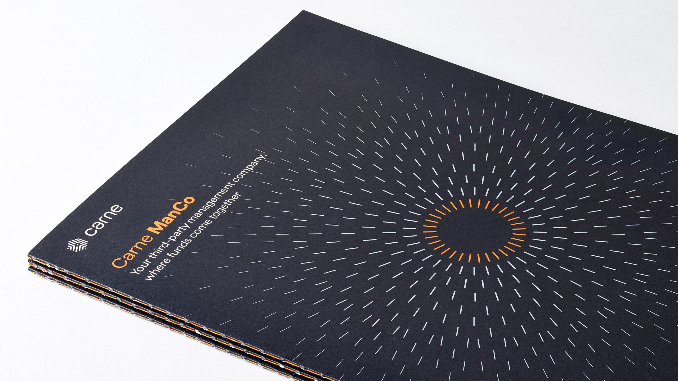
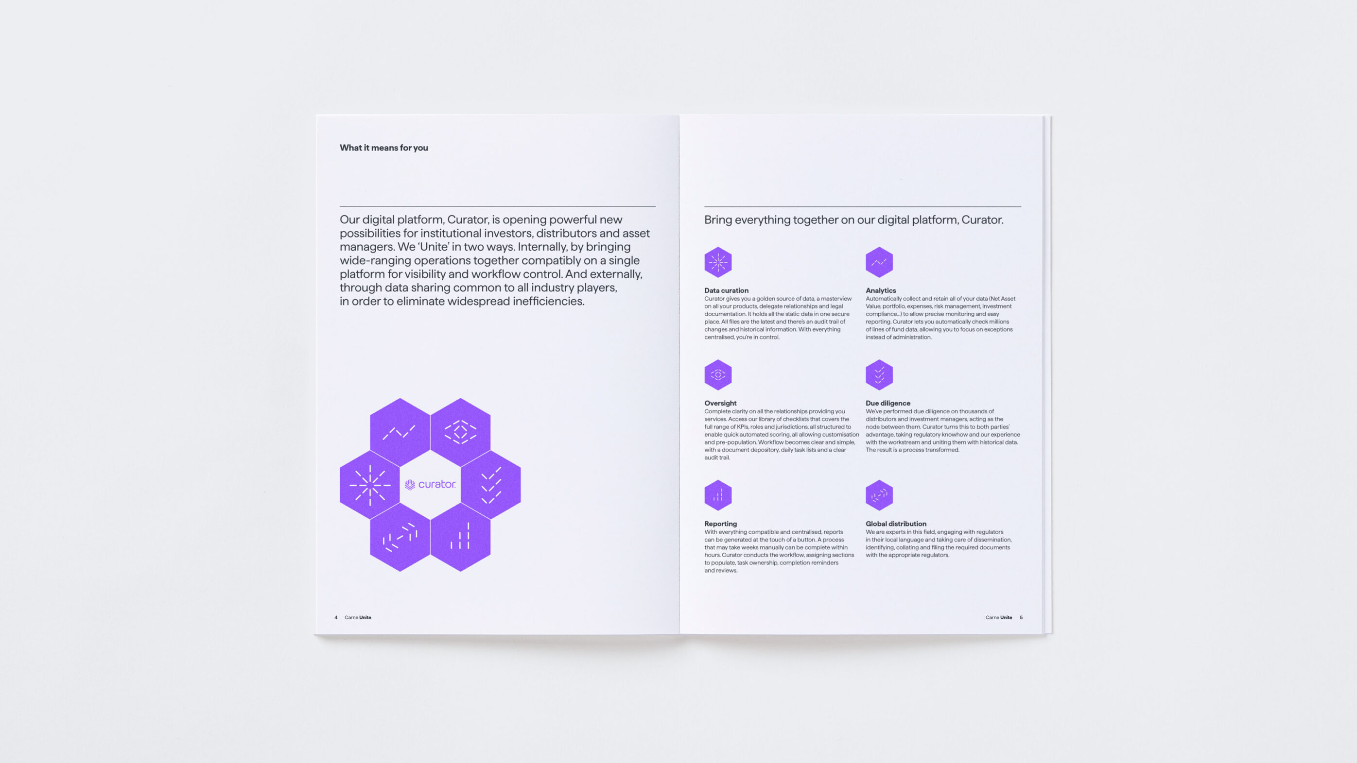
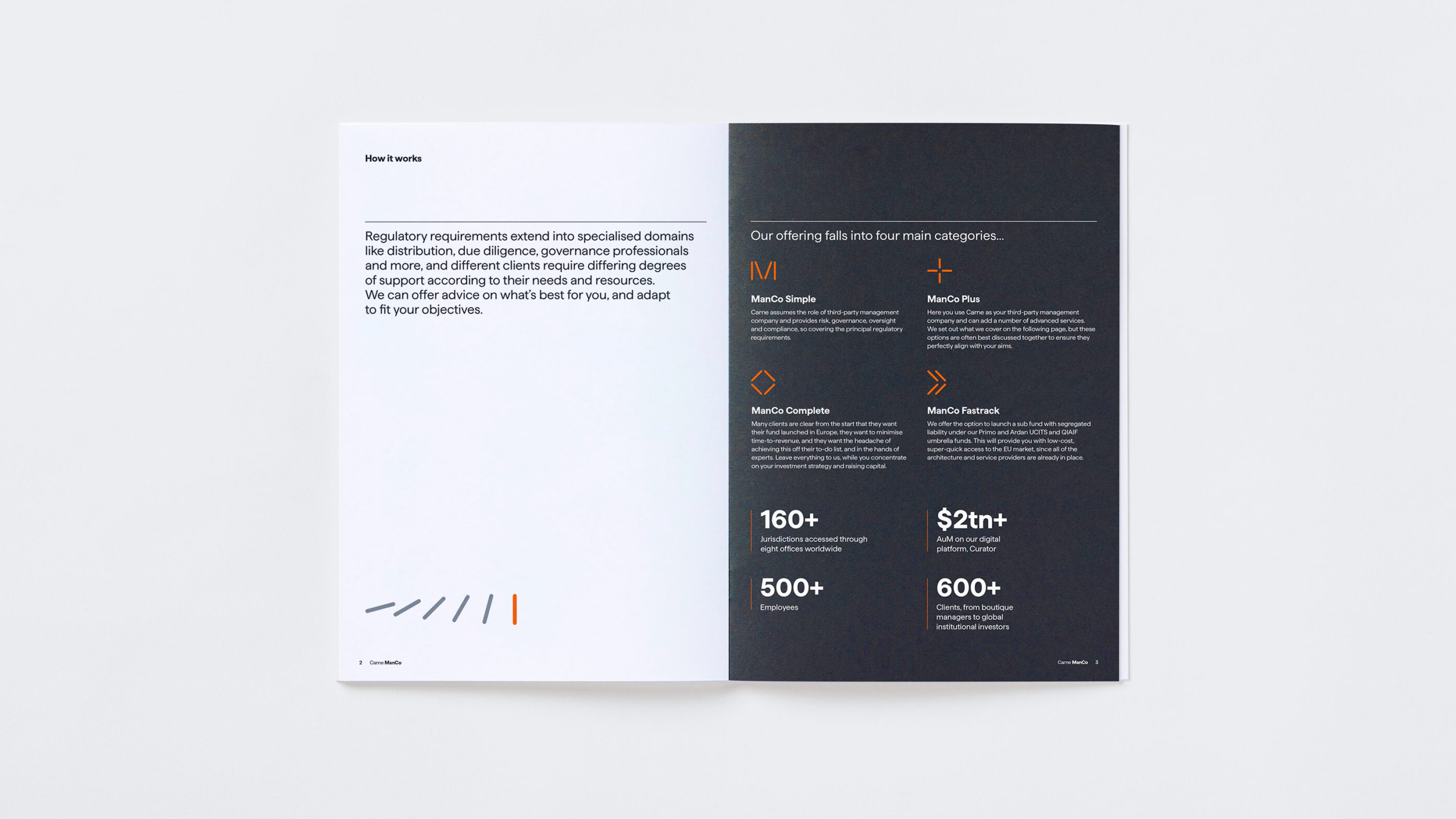
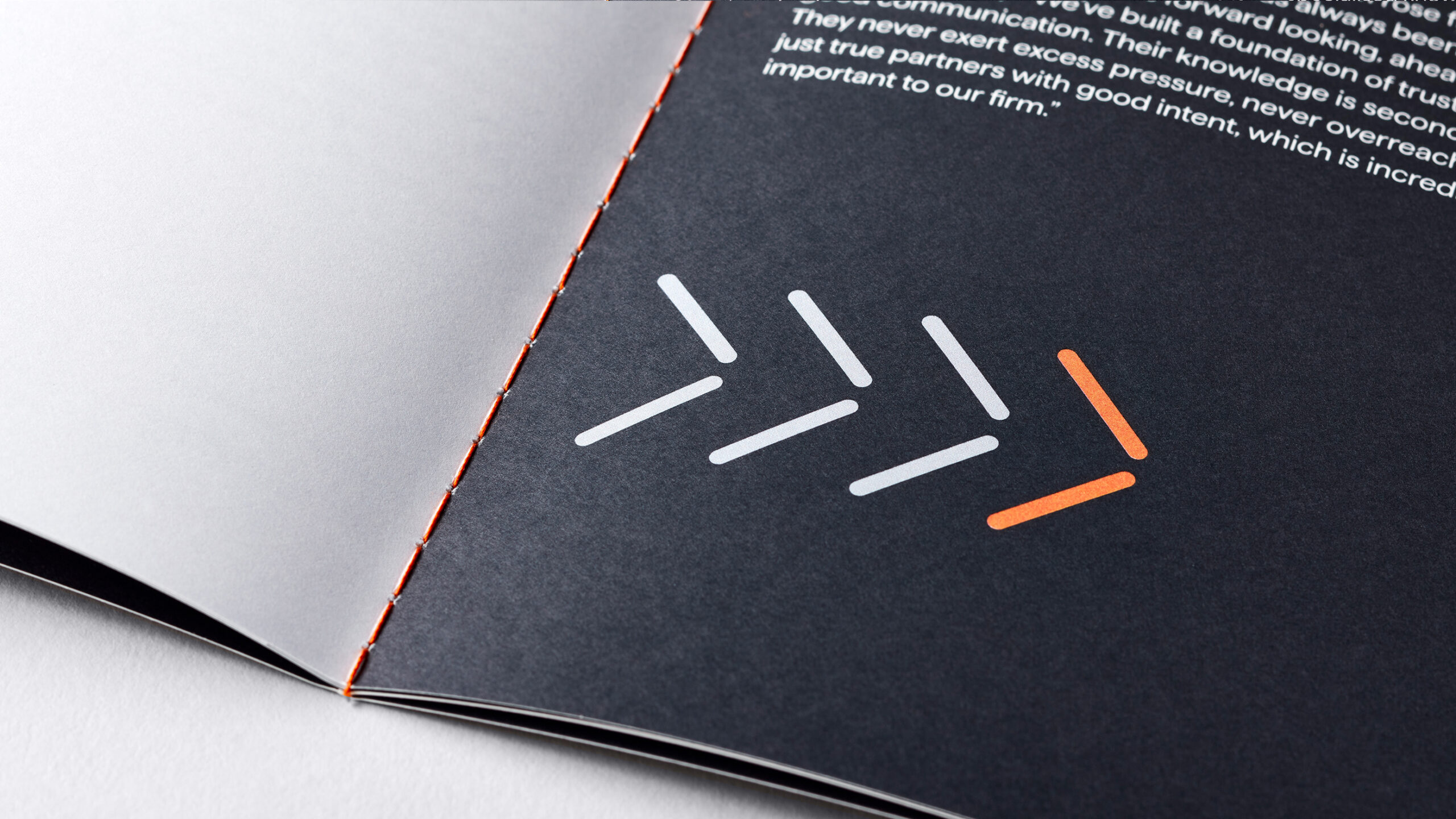
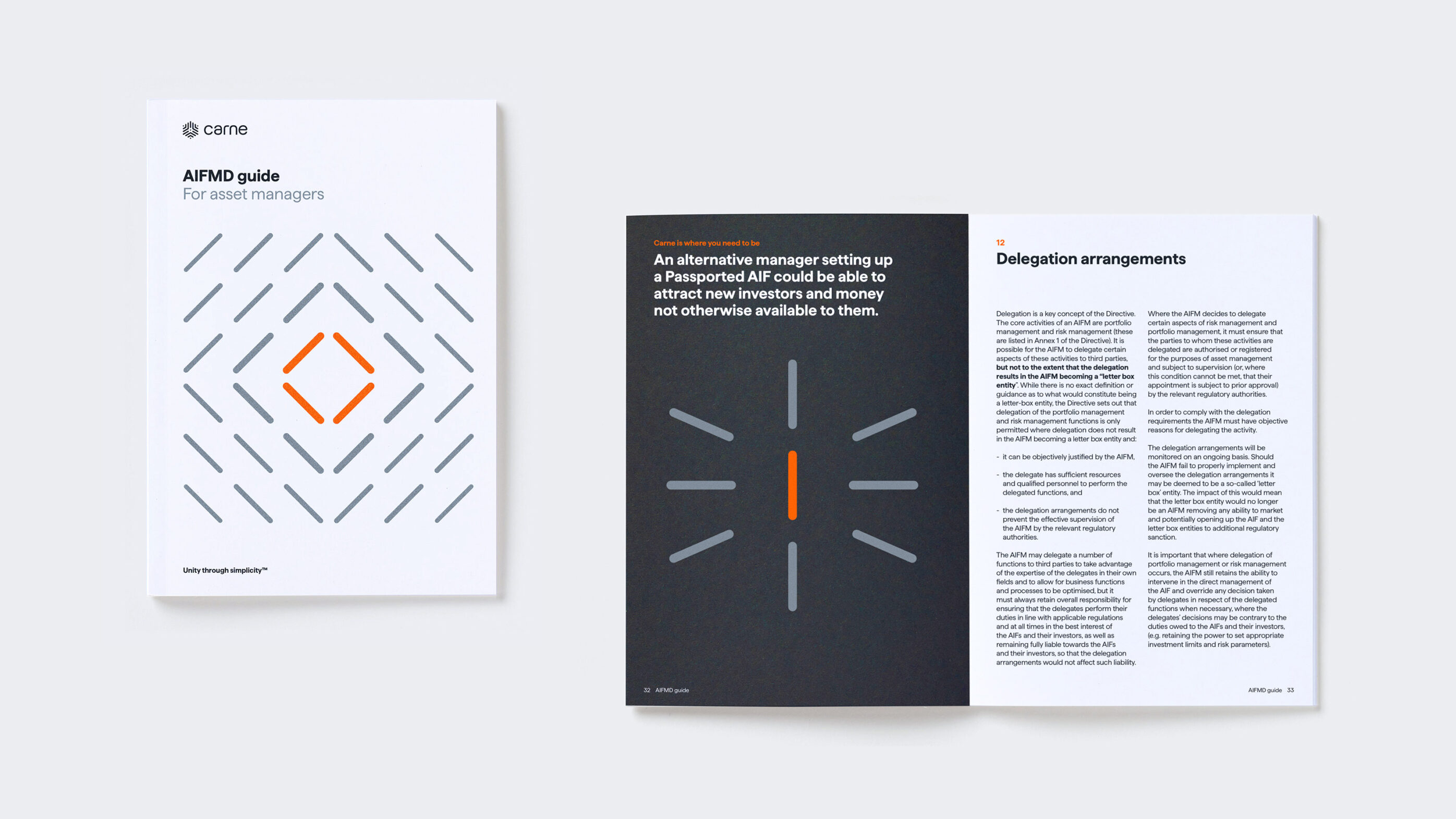
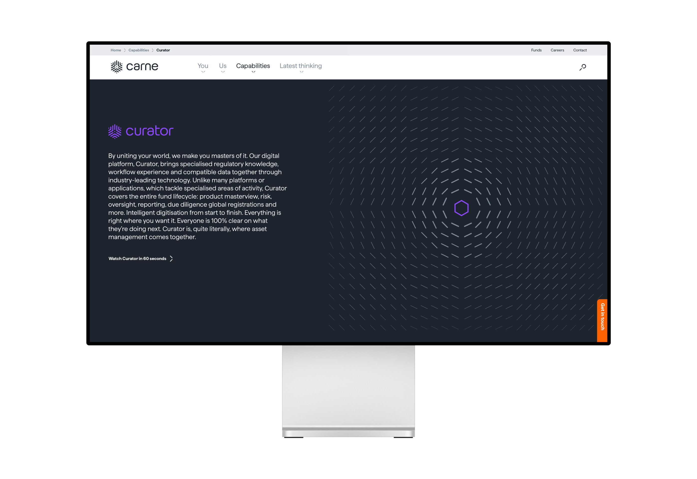
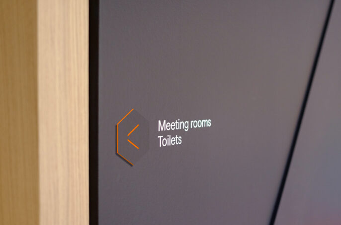
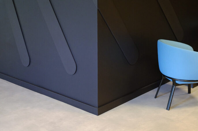
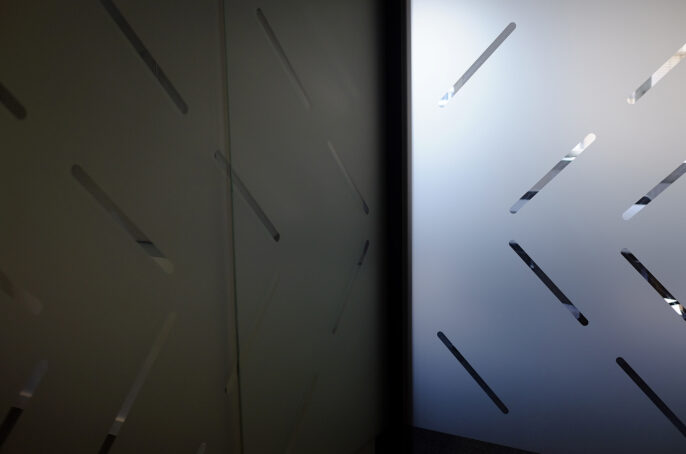
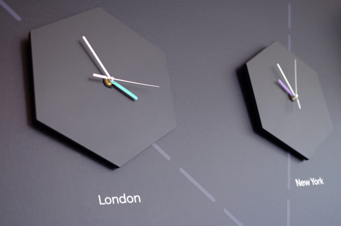
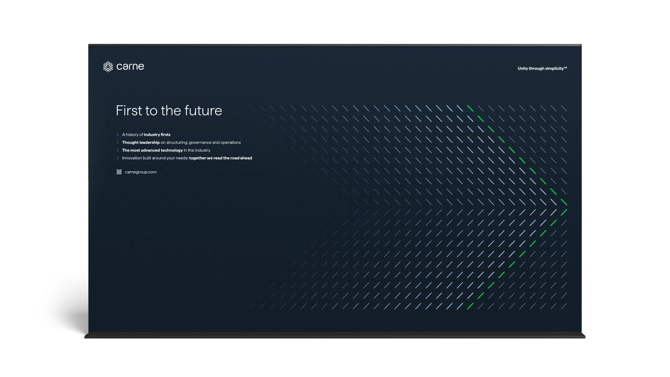
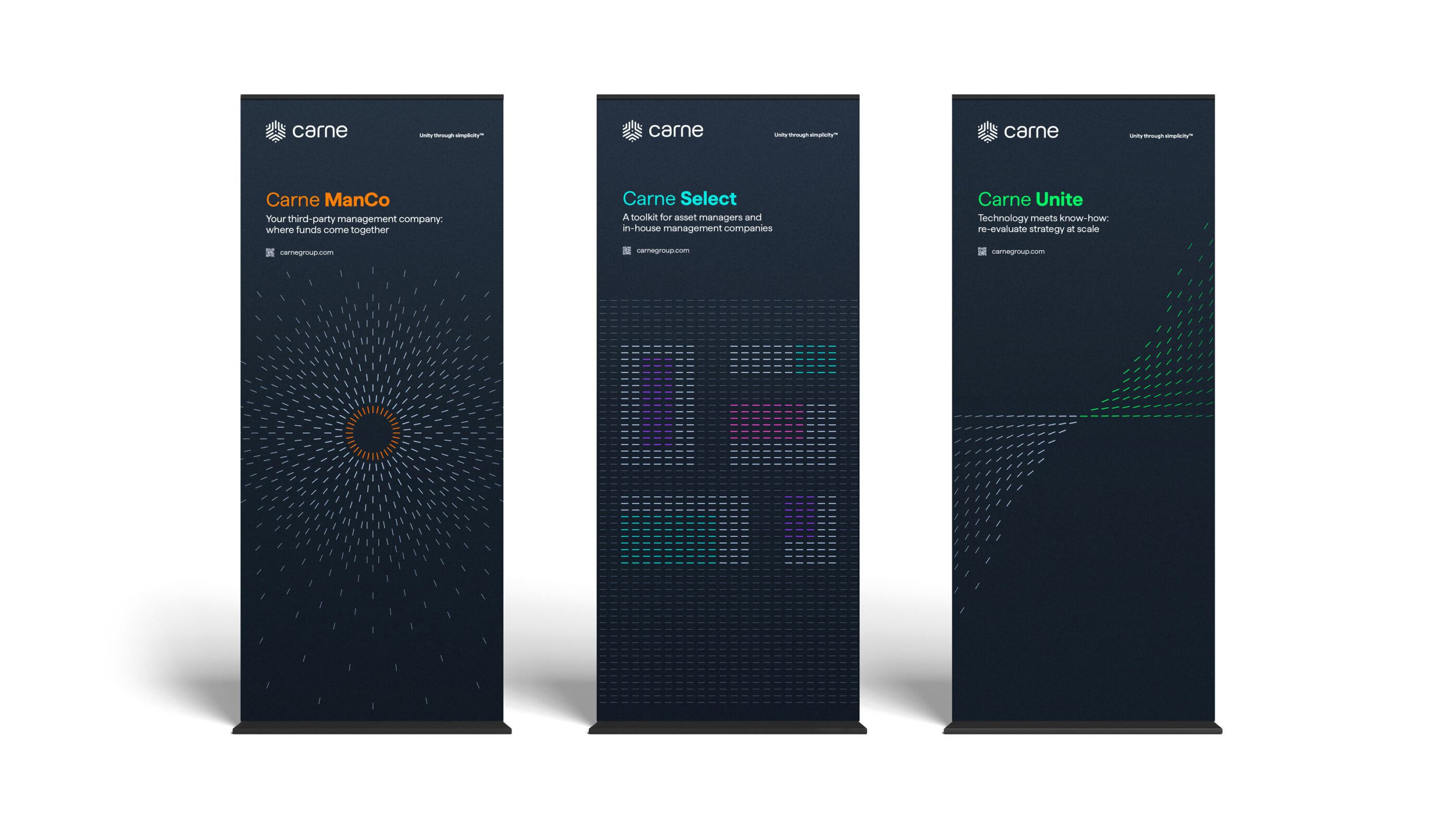
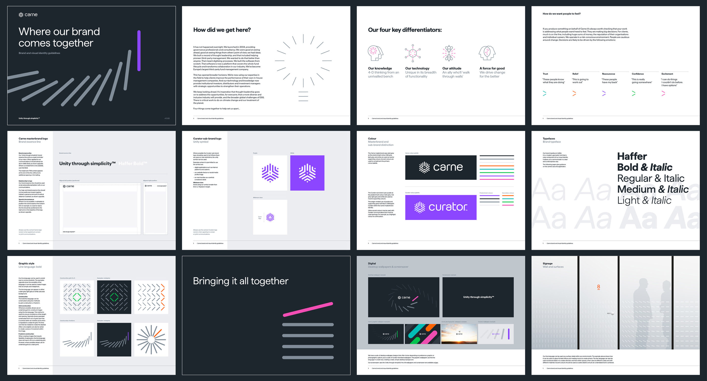
Carne recognised the potential of digitisation within the sector and required a b2b brand strategy that could help realise their vision for the future. Following a four-month strategic review with hundreds of hours of interviews and workshops, we developed a brand strategy around two key insights: they brought fragmented operations together in one place, at fund, company and industry-wide levels. Secondly, they greatly simplified things for their clients. We built the brand around the core idea of ‘Unity through simplicity’ and expressed it through a ‘language of lines’ to suggest how digitisation with Carne can unite an industry of many disconnected parts. We simplified their product offering into three clear narratives and rebranded their technology platform to Curator – giving their clients the power to curate their entire fund universe.


The outcome
The new b2b brand strategy has been well received with employees and clients. Carne’s old website generated no new business leads in the four months prior to rebrand. The new site delivered 40 new good quality leads in four months post rebrand. Two industry lunches produced no business leads pre-rebrand. A third, post rebrand, produced 10. Today, we continue to support Carne with their vision.
Transform Europe Branding Awards
Gold: Best brand development to reflect changed mission/positioning
Gold: Best implementation of a brand
Gold: Best brand architecture
Silver: Best creative strategy
Silver: Best visual identity in the financial services sector
Bronze: Best use of a visual property
World Brand Design Society Awards
Silver: Brand redesign
There is just one item in our household that is cherished by every member of our family: a portrait of our four children when they were young. The artist told us it would take up to 18 months. This was, he said, about capturing not just their appearance, but something of their essence, their character and their soul. That is how I feel about Clout’s rebrand of our company. They have done what I think is very rare in our sector and in branding in general: capture our spirit as well as our business vision
What we did
B2B brand strategy
Brand architecture
Naming
Visual identity
Print/digital communications
Website
Event collateral
Interior branding
Internal brand rollout
Brand films
Global guidelines
Our collaborators
Scott Perry, brand strategy and writing
Hambly Freeman, website development
weareseventeen, animation
Rob Clarke, typography refinement