Sebra
Visual identity
Sebra is a book imprint brand from Welsh language publisher Atebol.
The challenge
More commonly known for children’s books and educational resources, Atebol wanted to expand their reach to adults through unique fiction, non-fiction and informative titles. We were asked to design a visual identity and launch campaign to promote the new book imprint.
Our approach
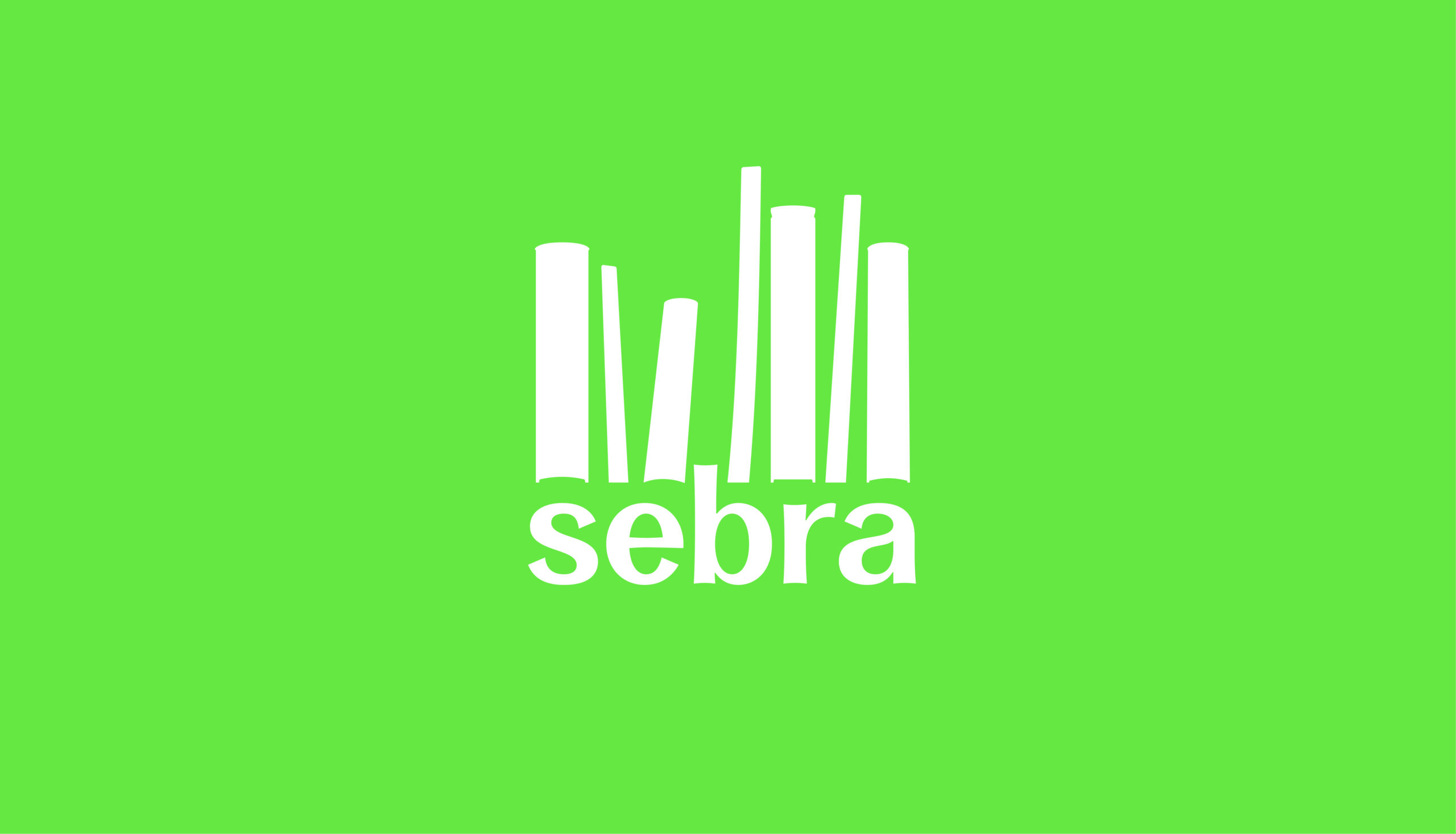
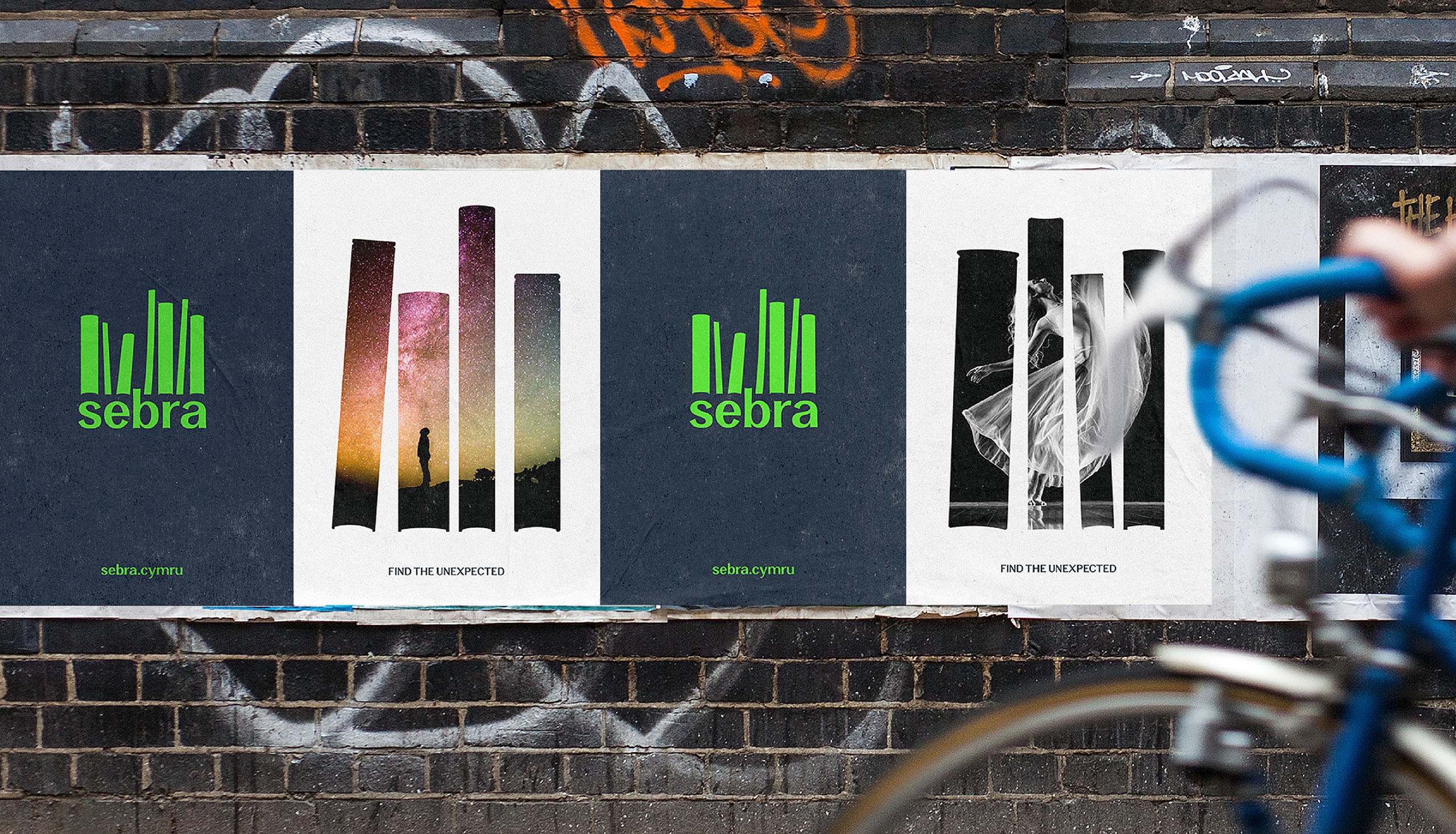
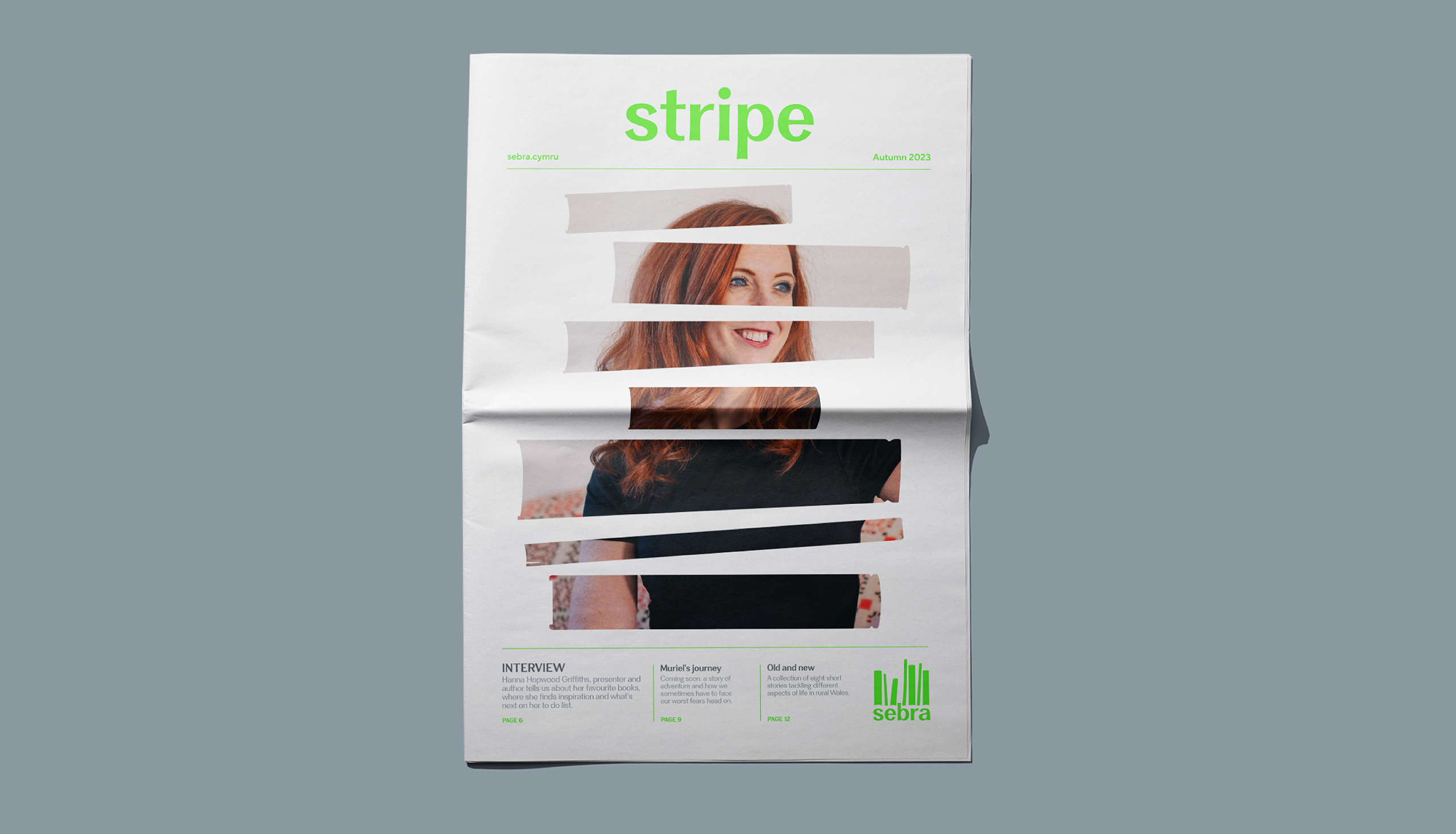
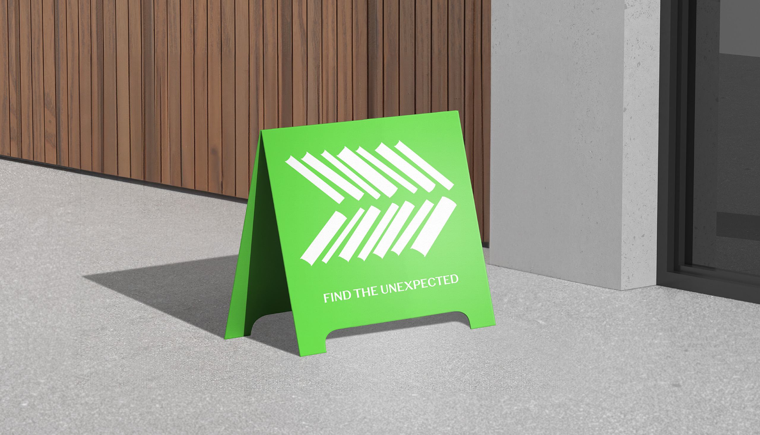
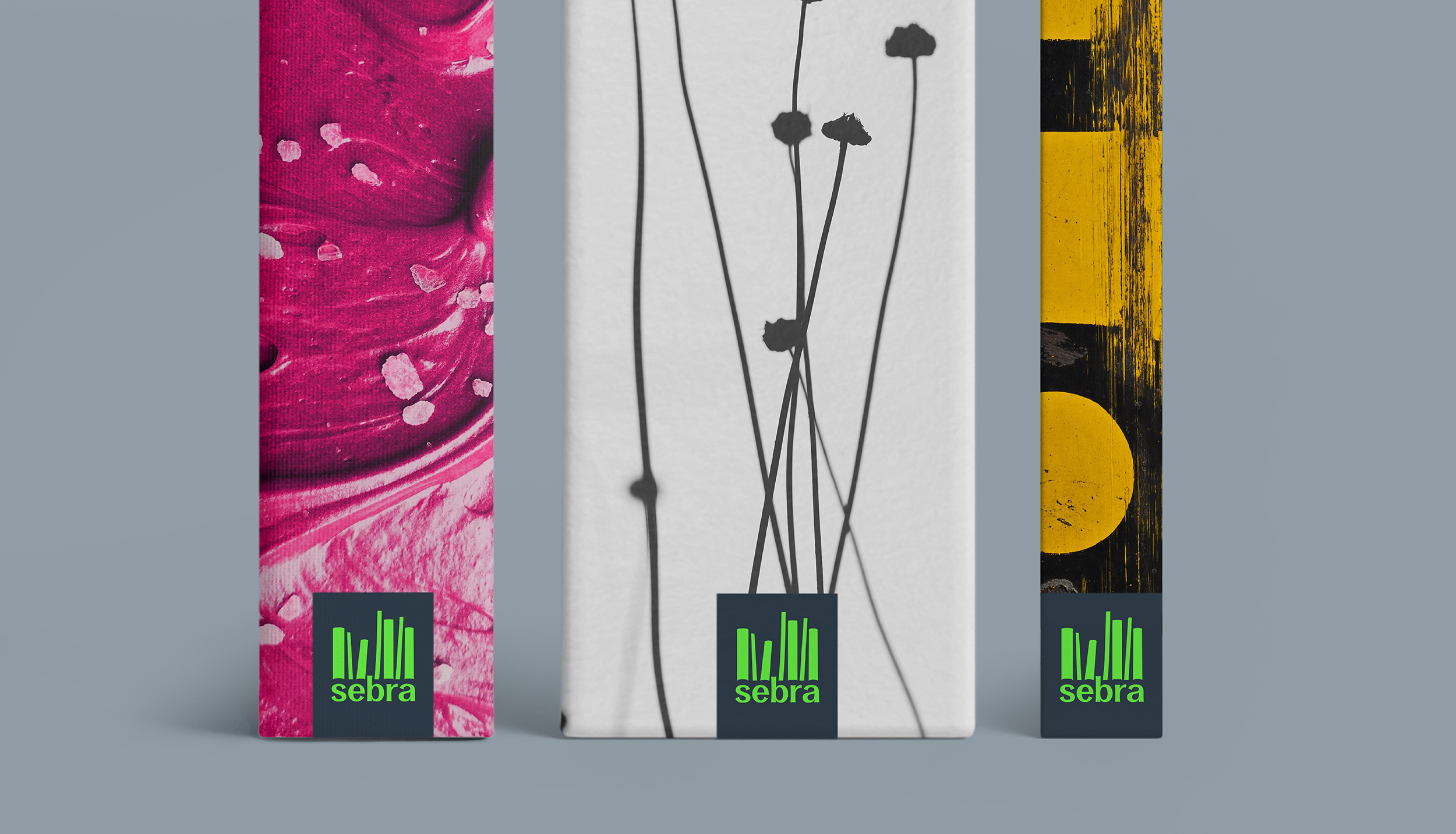
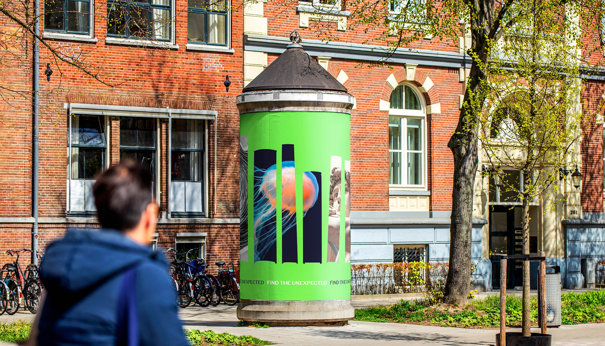
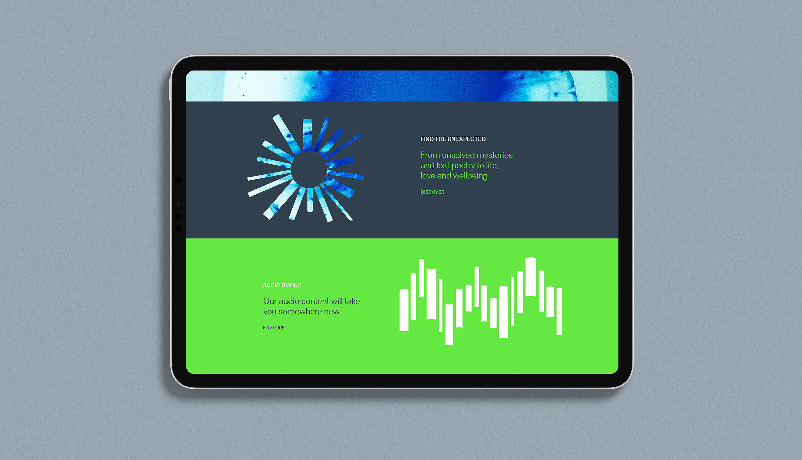
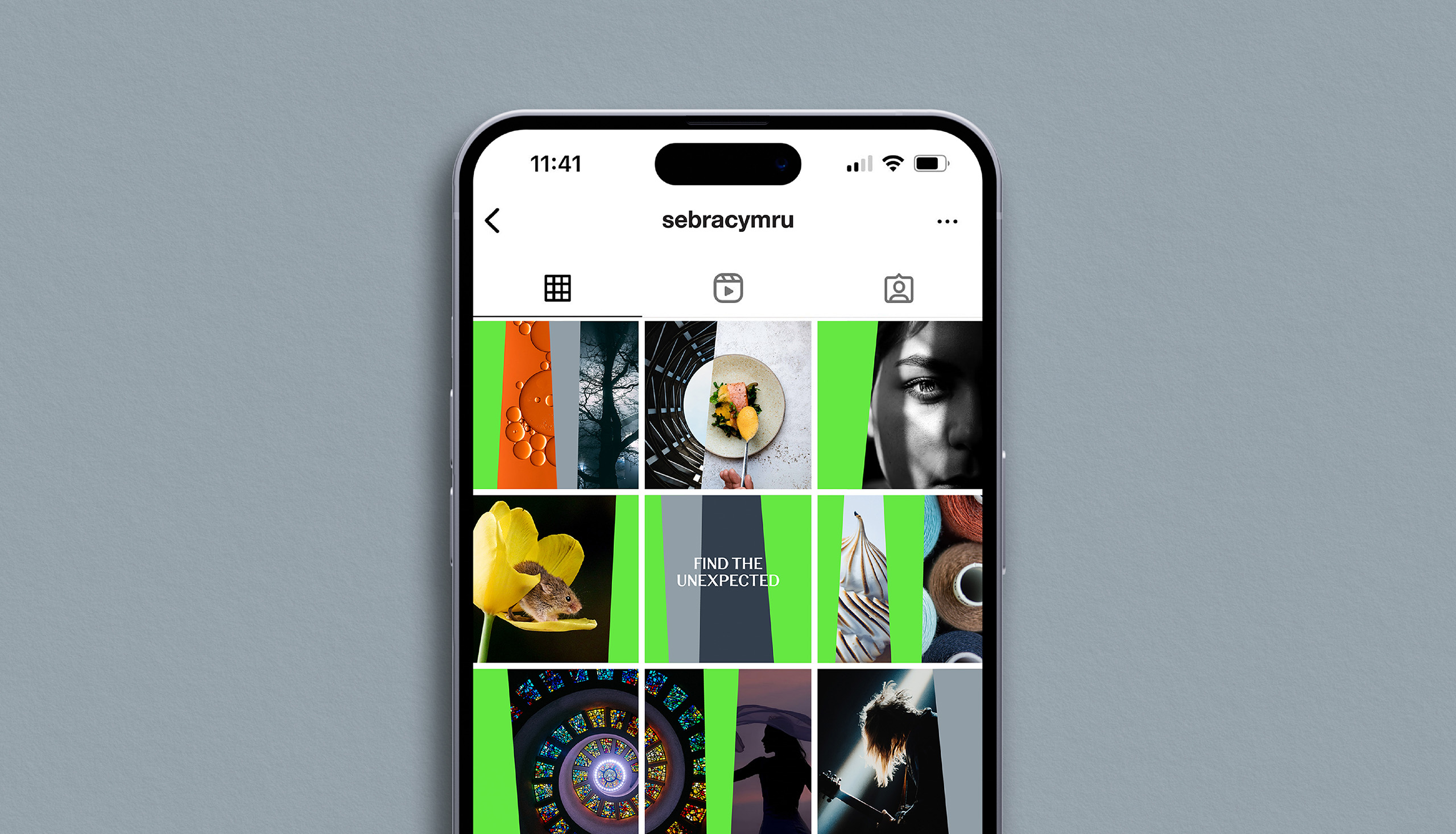
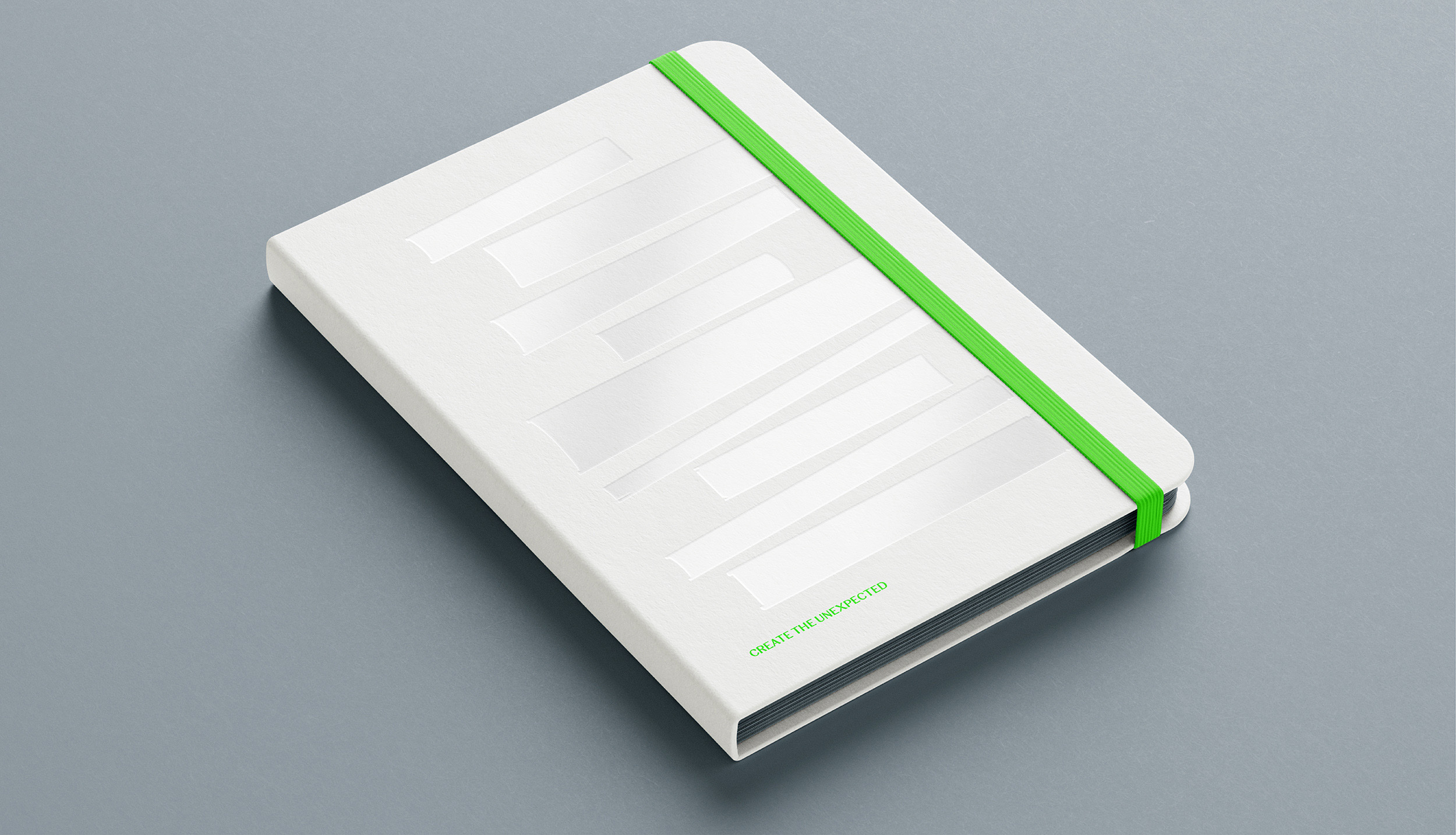
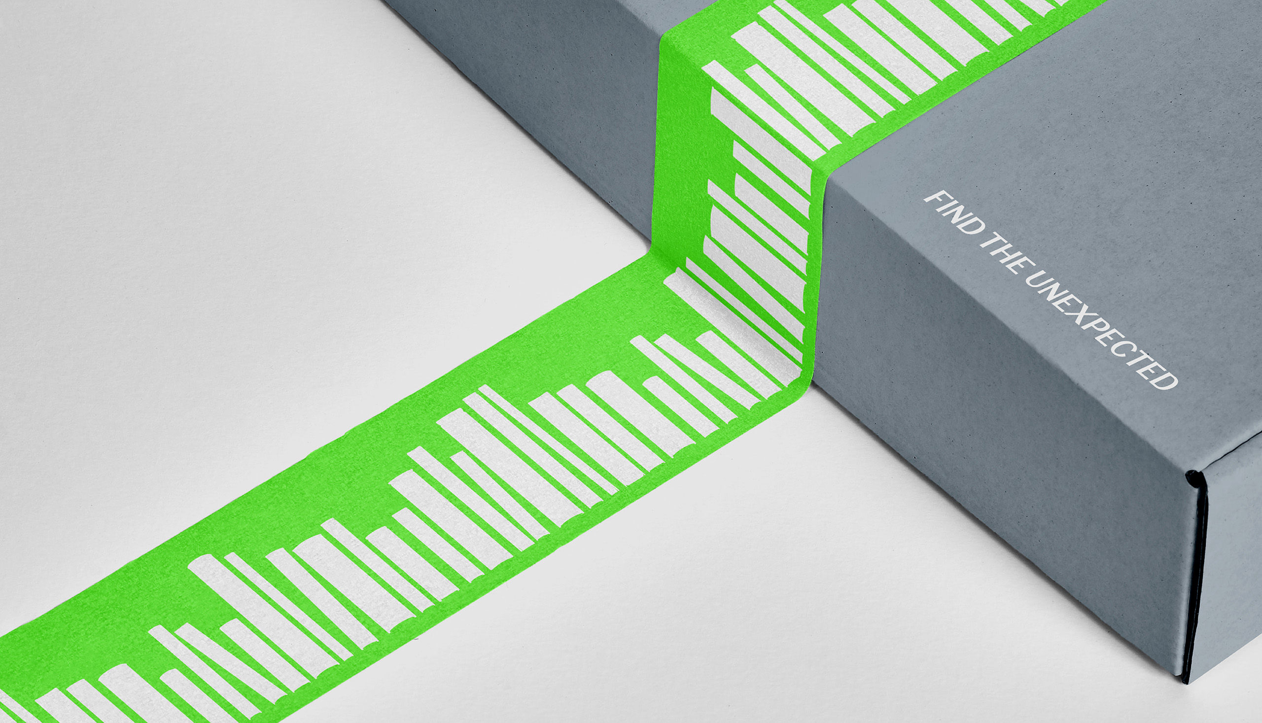
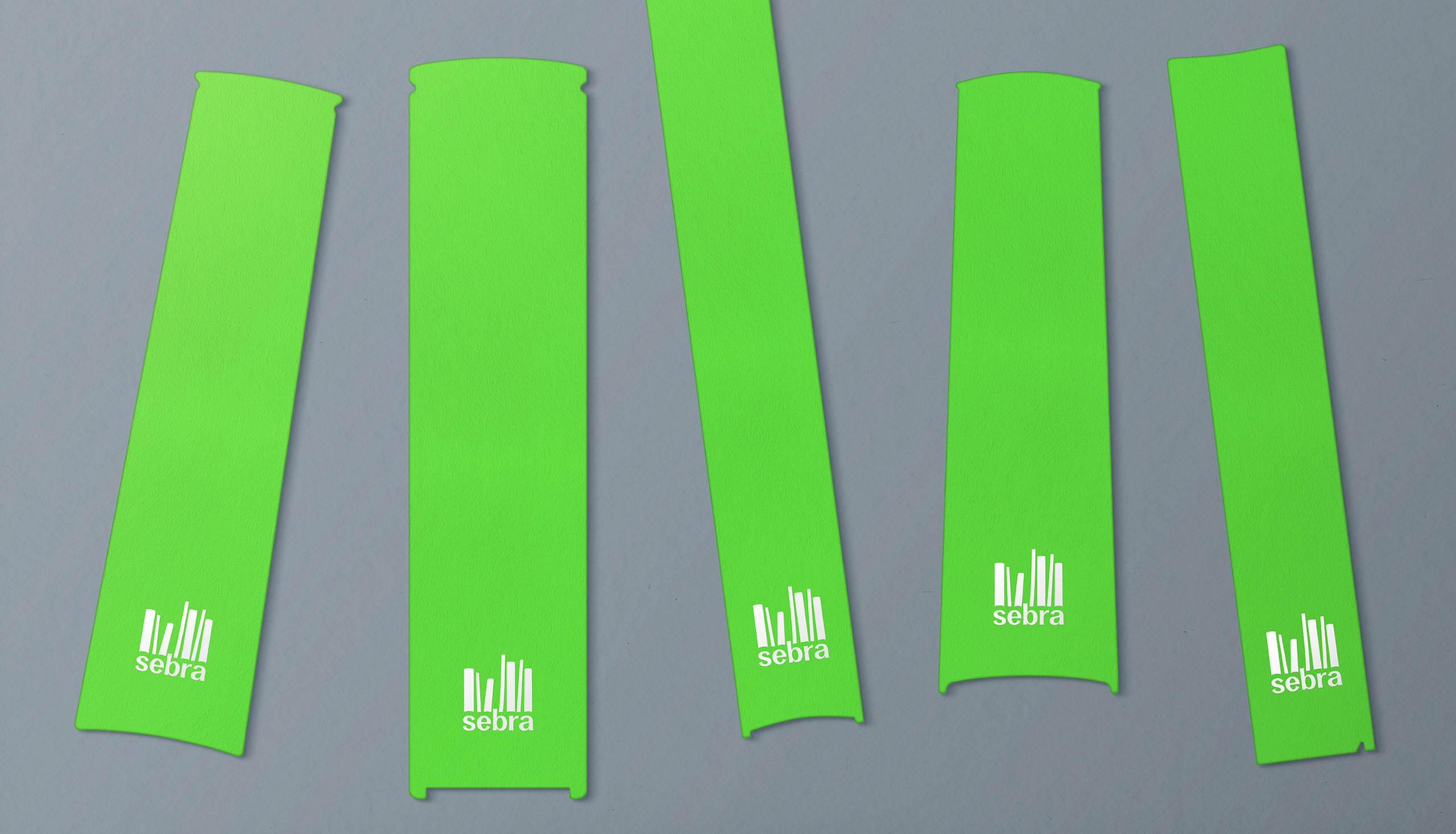
Their commercial strategy is to curate and promote unique content from Welsh writing talent. The name Sebra (Welsh for Zebra) was chosen for its bilingual quality and how it reflected Atebol’s bold, original offering of unusual content that is impossible to ignore. To link the idea to literature we designed a logotype out of books arranged in a striped formation. The concept was carried into the wider visual identity where images appear within book ‘apertures’ to reinforce the diverse mix of subject matter and the overarching brand narrative ‘Find the unexpected’. A bright green and white colour palette underpinned by neutral greys was introduced to compliment the language and to further enhance standout.

The outcome
The new brand was launched at the 2023 National Eisteddfod of Wales, the largest music and literary festival in Europe. Feedback has been overwhelmingly positive with comments like ‘this is clever’, and ‘this feels fresh and different’. During the launch event several published authors made approaches to register their interest.
The brand has been very well received. Kudos to all especially given the tight turnaround. We really appreciate Clout’s creative leadership and efficiency
What we did
Visual identity
Launch campaign
Print and digital assets
Guidelines
